I’ve been taking some painting classes at a local university for the past couple years. I love learning about fine art! It’s been so interesting to see the difference between an education in Design (what I did my first time around in college) versus an education in Fine Art. One of the biggest differences I’ve seen is how the idea of color is approached.
In both areas, Color Theory is very important. In Design I learned about the meaning behind different colors (a logo for a tech business would use very different colors than a logo for a quilting store, for example). We learned how colors are created on our computer screen and then translated into ink. We used that knowledge to learn how to pair colors together to make a strong color scheme.
In painting, colors are all different. You don’t pick out 3 colors and stick with just them, like you would in a logo. You pick a few main colors and then use thousands of variations of those colors to create a realistic painting. With so many options, it’s easier to get lost in the colors. So, as a painter, you need a way to organize all the thousands of color variations. This is where Value (how dark or light the color is) comes in. Value can take a thousand colors and pull them together into art.
In fact, Value is so important that when you plan the layout of a painting, you don’t just plan where the objects will go, you plan out what part will be light and what will be dark. And once you start painting, you learn that most the time getting the right value is more important than getting the correct color. (Fun Fact: when you look closely at an impressionist painting of a woman wearing a white dress, you’ll notice the dress isn’t painted white at all. It’s made up of strokes of pinks and purples and blues, but because they’re all the right value, the dress looks white.)
Picking out fabrics for a sewing projects is usually a lot more like the color theory we use for Painting than the one we use for Design. If you pick a fabric with a print (as opposed to a solid color fabric), you’ll likely be working with several different colors in just one fabric swatch. If you’re making a quilt, you’ll be picking out lots of different fabrics to work with, each with it’s own combination of colors. It can be easy to get lost with all those colors to organize, so let’s talk about how to put them together according to value.
First off, we need to figure out what values we have. There are a few ways to do this, if you squint your eyes enough, colors fade away and values stand true (which is why painters squint when looking at their subjects). You could buy these nifty Sew Red Glasses that do the same without forcing you to walk around squinting in your quilt shop. Personally, I like to snap a photo with my phone and change it to black and white- no squinting or extra hardware necessary 🙂 (although those red glass do look kind fun!).
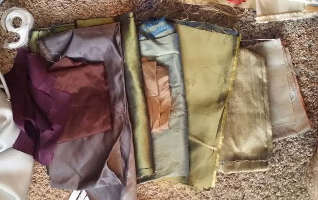
I recently did just that while picking out fabrics for my next quilt. I had the fabrics below picked out and felt I had a pretty good range. Just to be sure, I snapped a photo and changed it to black and white, right on my phone.


To be honest, I was surprised. The colors had me fooled into thinking I had a full value range. And I do, on the left side at least (the dark fabrics), but then I move into medium and then onto… medium again. I really thought those last colors were lighter! Don’t get me wrong- it’s beautiful fabric. I love the colors, and I plan to use them for my quilt. I just realized I needed a few more light fabrics in there to make sure my quilt didn’t get boring in the light ranges.
Now that I’ve found some fabrics to fill in the gap, I’m planning out my quilt. I already have the design drawn, and my colors picked out. I just need to figure out how the values will interact with each other.
Here’s on of the last quilts I designed and sewed:

Now, I love this quilt. It got into 3 juried shows and even won an award at one. However, my skills have grown since I made this. When I designed it I hadn’t started my painting classes. I was still thinking of colors like a Designer, not an Artist who is constantly thinking of value. When I photographed the final quilt and turned it black and white, the values work fine together, but they’re not particularly playful or fun.
If I could go back and do it again, I’d keep the layout and color scheme the same. But instead of using the same off white background everywhere I appliqued, I’d use three different shades of off white, maybe starting with the lightest on the outside and getting darker as I moved toward the center. I’d do the same with the leaves- the green fabric on the outside border is actually different from what I used on the inside green leaves, but you’d never know from the photo because they’re the same value. I’d pick a lighter value for the outside leaves, to keep with the playful theme of values growing darker until they hit the middle star.
For a better example, here are some quilts from some shows I’ve attended in the past few years. They all use value in amazing ways.

Above: We’ve got a complex design that is pulled together with a perfect use of value. Notice how the rings work themselves in a light, dark, light, dark pattern. The colors used in the light areas are different, but because the values are similar, the pattern holds true.
Below: I love this example. When you look at the fabrics used, they really don’t go together at all. And yet they create a beautiful quilt- all because the values are worked from dark to light. This is a great example of where value can be more important than color, just like in the Impressionist paintings.

Last of all, we’ve got this amazing mosaic quilt. it’s hard to tell in this photo, but every single different color in this is a different hexagon of fabric. Again, all those thousands of colors are pulled together into a beautiful design because of value. Notice how the rings go from light to dark, light to dark.

Recognizing the color value of fabrics can definitely help you as you lay out your next project. I’ve definitely seen an improvement in my work since I’ve started paying attention to value, and I’m sure you will too!
If you need more fabric we might have to go shopping 🙂
Couldn’t say no to that 🙂